Fleming & Cazalas
marrying handcrafted wooden and naturally dyed goods
- Branding
- Graphic Design
Purpose
Fleming & Cazalas came to Joyage Studio because they were looking to invest in their brand identity and create something that spoke to both of their sentimentalities when it came to personality and the interesting dichotomy of Amelia’s work with dying fabrics and Torrey’s work with wood. The goal was to unify their crafts into one branding while symbolizing the unique beauty each person and craft brings to their business.
Branding two crafts into one vision
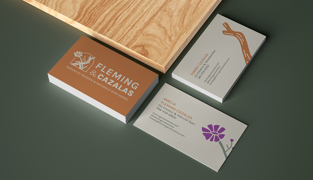
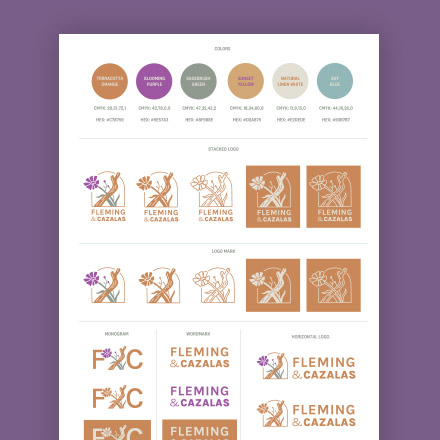
A flexible brand identity system
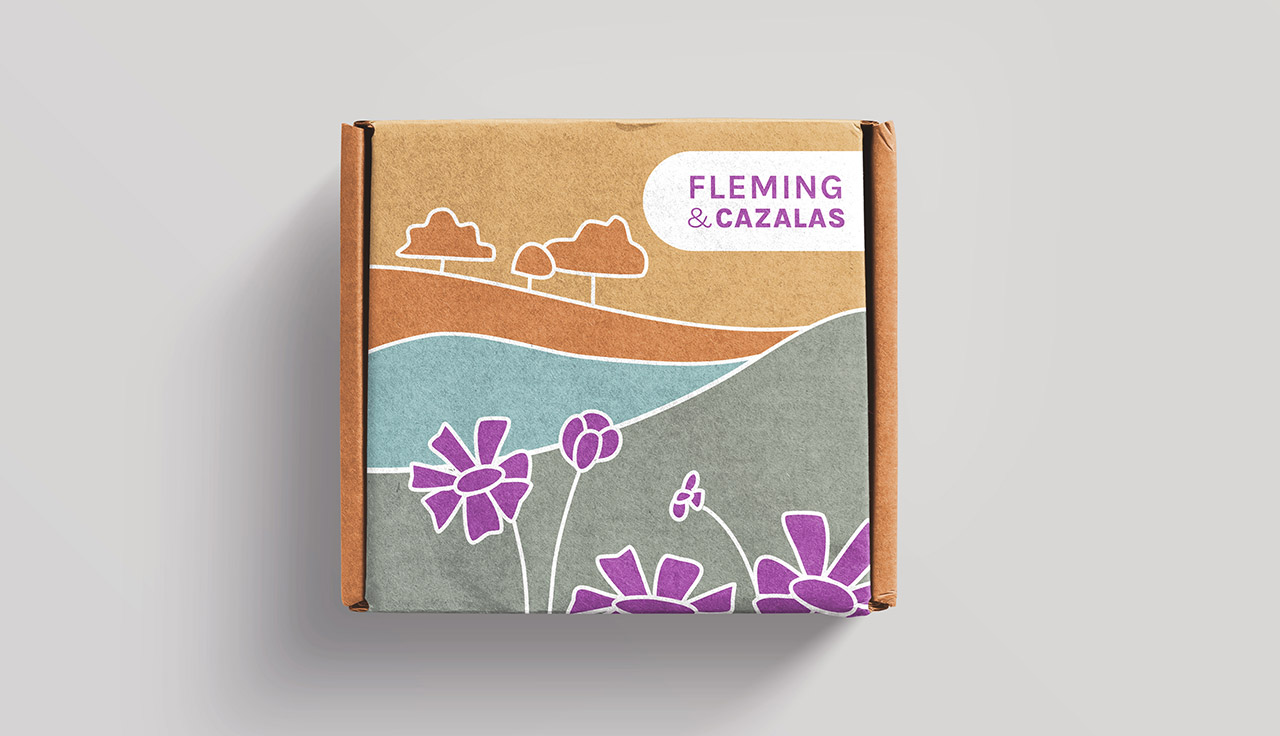
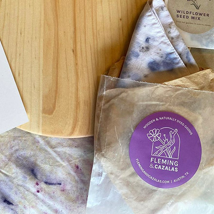
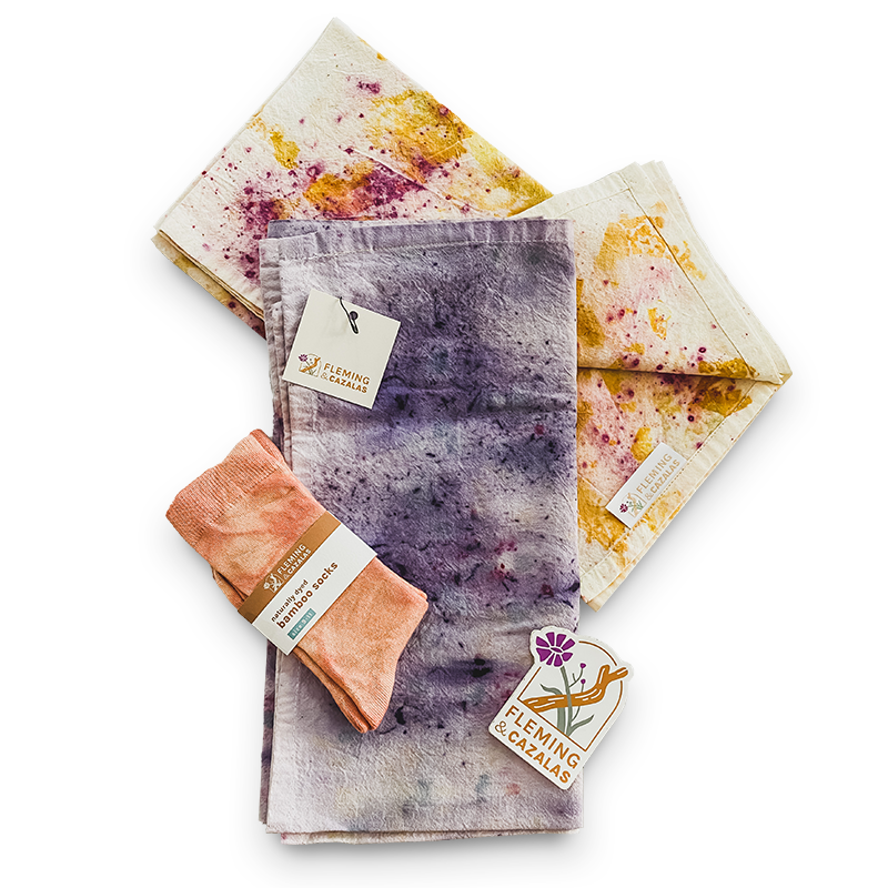
Armed with their brand board, Fleming & Cazalas were able to develop multiple additional assets 100% on their own. They created fabric tags, printed care tags, stickers for their wood balm product and packaging for their sock products.
Working with Joyage Studio helped them not only create, but also sustain their brand identity and system. Which in the end, saved them money as they’ve grown and expanded their product offerings.
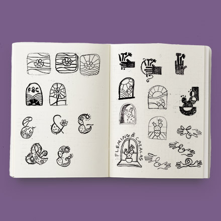
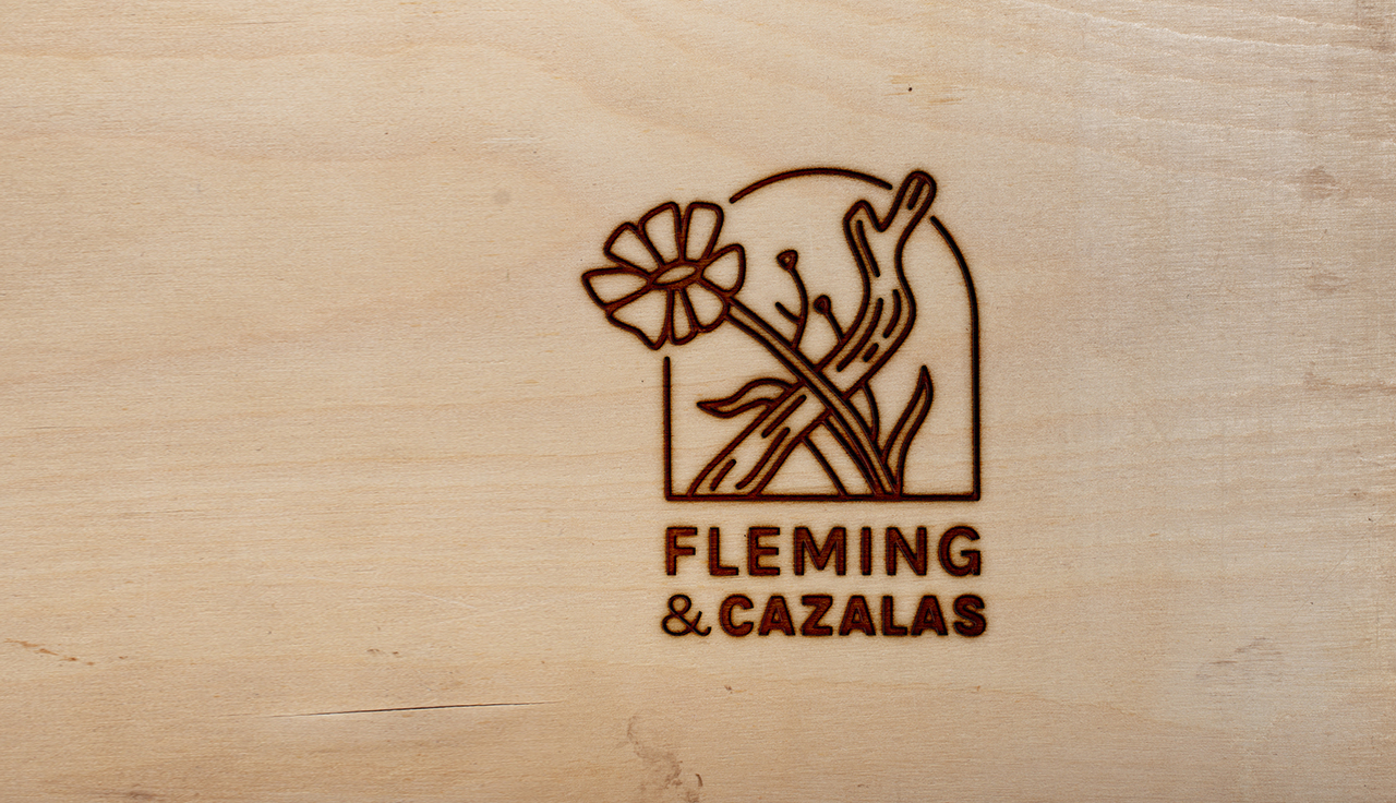
Opening the window of opportunity
When it came to exploring design options, both Torrey and Amelia were interested in an arch or window shape to show a connection between nature and also the indoors. The use of flowers for dying and wood from forests made it essential that we not only unify the crafts, but also show a connection with the final products with their original from their natural landscape.
Because of this, we explored arch shapes, flowers, cacti (for their symbolism of unity), branches, trees and sandy landscapes.