Twisted Mac
Twisting up a popular classic
- Branding
- Website Design
- Graphic Design
Purpose
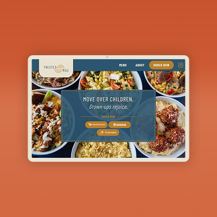
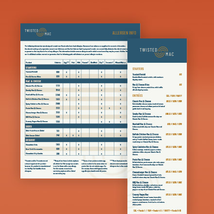
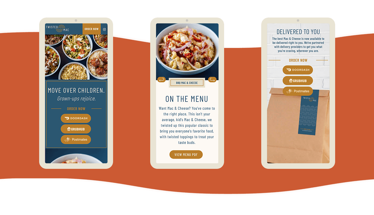
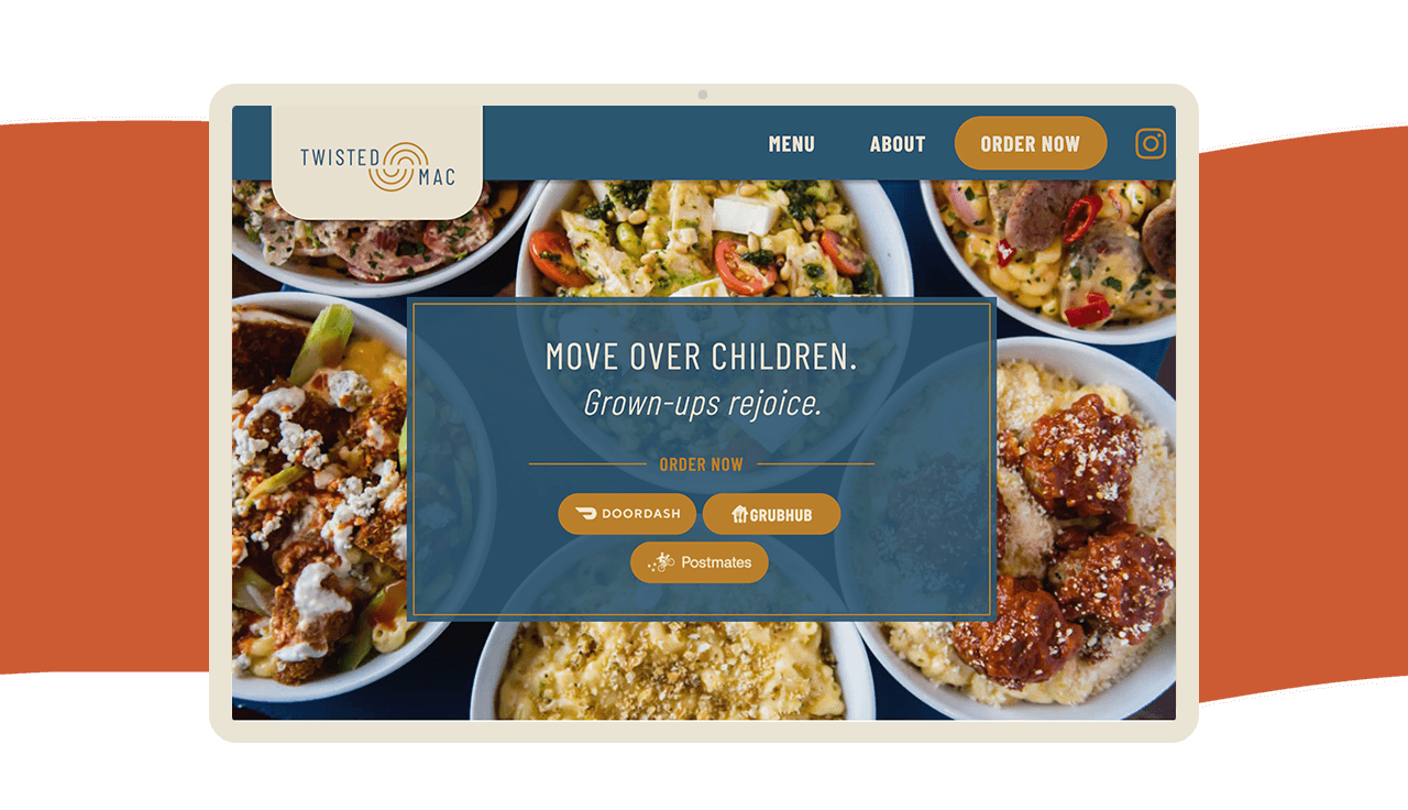
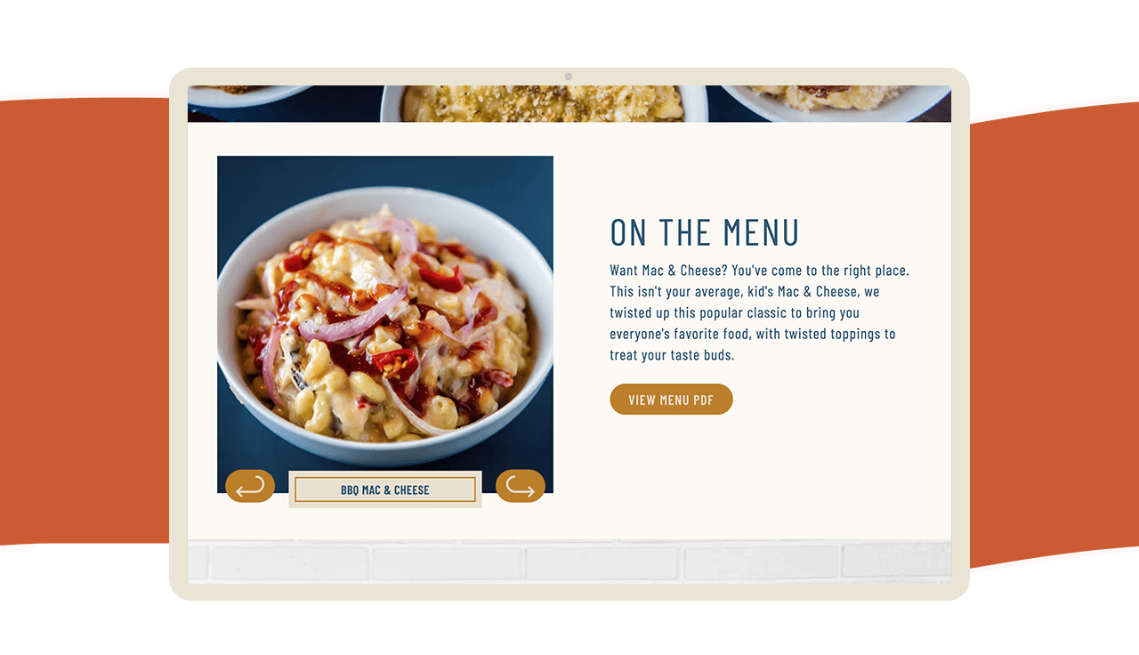
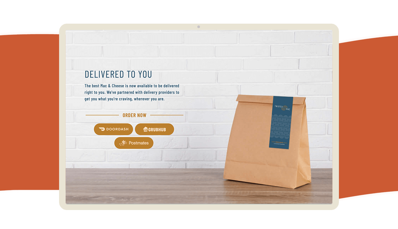
Twisted Mac was born to give the people what they want – the flavors of all of our favorite adult dishes on a bed of our childhood favorite — Mac and Cheese. To bring the adult feeling to the childlike dinner we created a classic, modern and minimal aesthetic to the brand.
Photography Credit: Lucy Beaugard
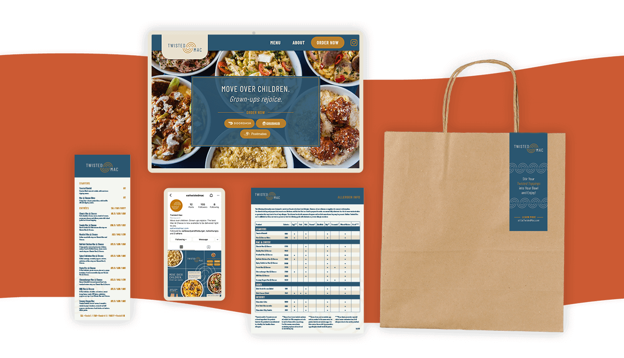
A delicious branding suite
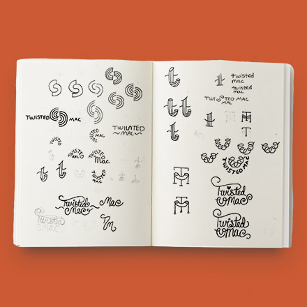
Noodling Away
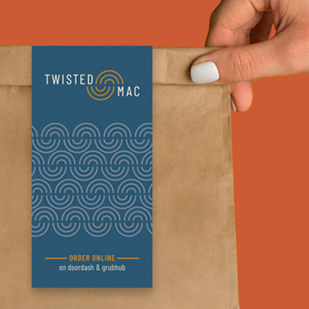
Twisted Mac planned to use elbow noodles for their macaroni so I spent a lot of time playing with the elbow shape in a way that would also match the “Twisted” description within the name of the brand. They also wanted the brand to have an elevated feeling versus being too playful so I focused on simple shapes, monograms and hand lettered typography.
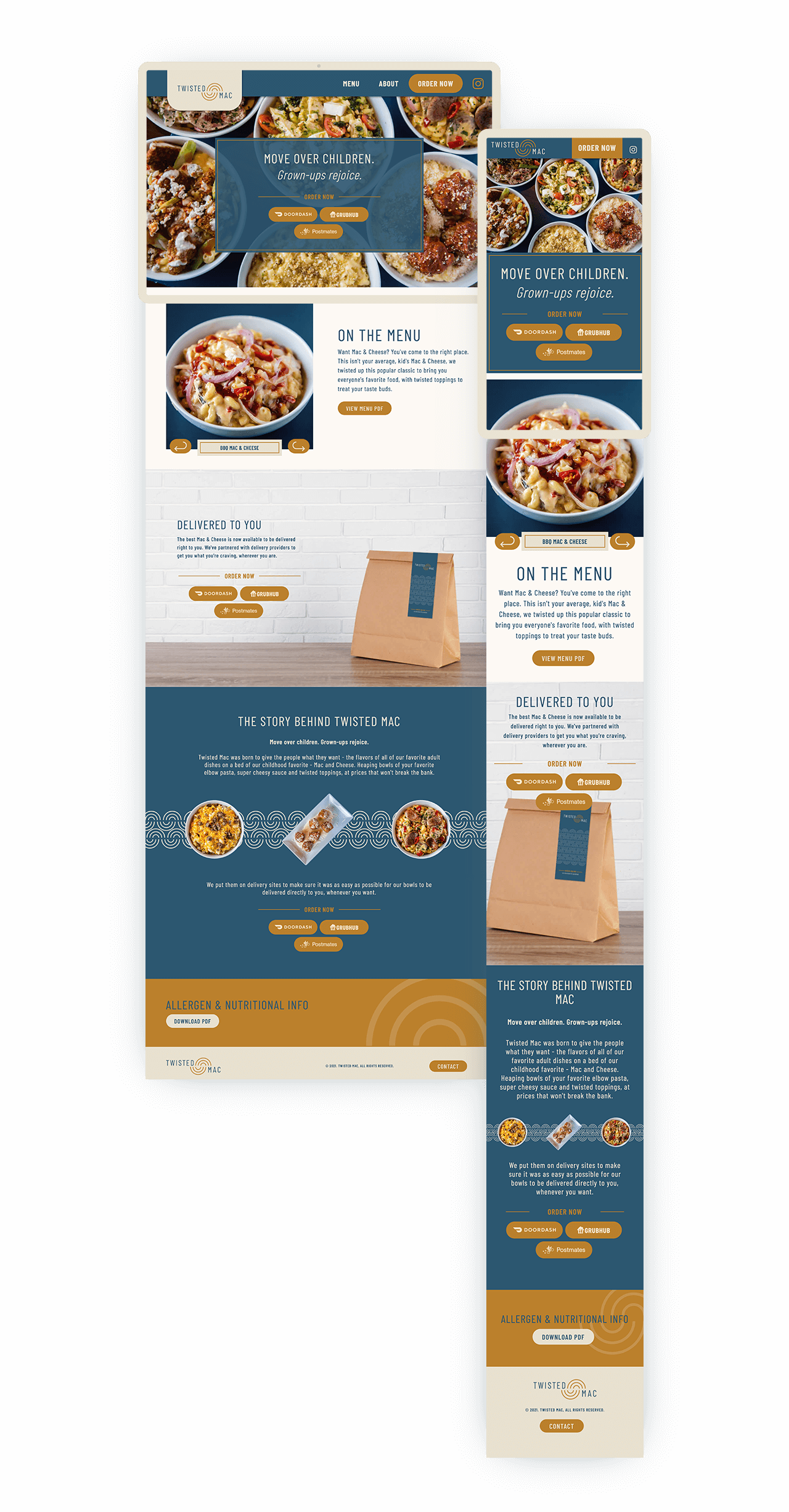
Website Design
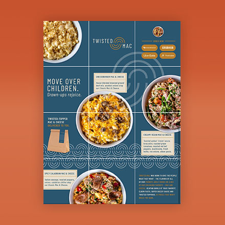
A savory start on instagram
To get Twisted Mac started off in social we created a 12 post grid showing off their cheesy creations and story of their brand.
Follow them!